POINTS
I am glad to start part 2 of the course elements of design. For the first exercise to place an object at different parts of the frame, i experimented with landscapes and birds. Image no 1 shows the tree a little of center, no 2 shows the image at the edge of the frame and no 3 shows the bird at the center of the frame.
I quite prefer image 1 because its more eye catching. It also obeys the rule of thirds with draws the eye to the tree creating some visual tension.
Image 2 has the tree at the edge of the frame and the city of kaduna in the background. I am not quite fascinated with the image because of the position of the tree in the frame. The sense of movement is very slight because it is proportional to the distance from the side.
For image 3 , first the bird is too small for the frame and the image does not create that visual attraction needed. And by positioning the image at the center, it gives it a static outlook which does,nt work. The 300mm lens has not quite worked well in this image.
According to Michael Freeman in The Photographers Eye (2007), the most basic element of all is the point and the simplest form of a point in a photograph is an isolated object seen from a distance, against a relatively plain background.
CENTRAL: STATIC AND USUALLY DULL
CLOSE TO THE EDGE: MARKEDLY ECCENTRIC, NEEDING SOME JUSTIFICATION
SLIGHTLY OFF-CENTER: MODERATELY DYNAMIC, WITHOUT BEING EXTREME
RELATIONSHIP BETWEEN POINTS
We now look at the relationship between several points. In previous exercises we have noted how the eye naturally moves from the srtonger point to the weaker point in a photography. Or lets say from the bigger point to the smaller point. We also noted how you can achieve balance in a photograph by positioning the bigger image to occupy at least two thirds of the frame.
However when visualizing two points with relatively the same proportions the eye would naturally move from one point to the other without settling visual weight on one point. This can be illustrated with a close-up shot of a two eyes as shown below.
 |
| Image 4 |
Thats how i took a similar picture and noted her observations on this.
MULTIPLE POINTS
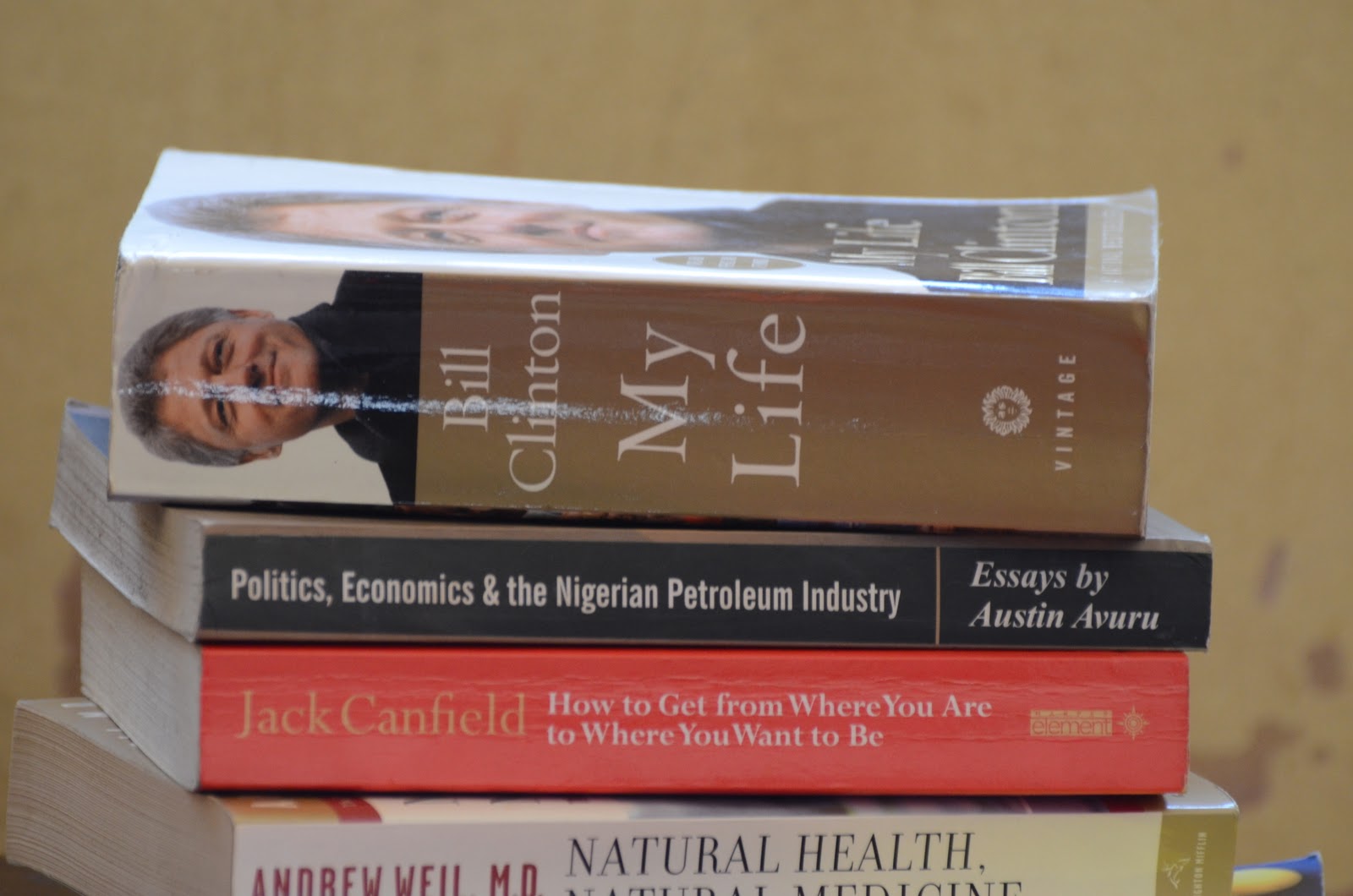
The next exercise was to take 6 pictures of still-life with an unfussy background. The instruction was to use six to ten similar sized objects each compact in shape. So i looked at the books in my library and decided to use them . Hopefully the genre will shed further light on my personality.
 |
| Image 1 |
 |
| Image 2 |
 |
| Image 3 |
 |
| Image 4 |
 |
| Image 5 |
 |
| Image 6 |
As can be seen i have a blow by blow sequence of photographs which have recorded my decisions. It looks arranged. Micheal Freeman discusses this The Photographers Eye(2007) where he says several points can unify an area by occupying the space between them.He goes on to say that the effect will depend on their location and spacing, and the eye having an irresistible tendency to create shapes from their arrangement. He says that the order and placement of several objects that need to be arranged can be very demanding. How well can one take the pictures without looking so artificial? He concludes that forces in nature are constatntly at work for us.
LINES
This next exercise on horizontal and vertical lin es is to help m,e discover appearances and in the process of searching be able to reach some conclusions.
 |
| Image 1: Vertical Line |
I took this shot from the car which was the most convenient position for me . It represenrts a vertical line.
 |
| Image 2: vertical |
This image 2 also portrays verticals in the sense that the windows are projected, though i could not get the best composition with wooden poles and wires spoiling the composition. Micheal Freeman in the Photographers Eye(2007) discusses vertical lines as the secondary primary component of the frame and so naturally seen in terms of alignment with the format and with the sides of the picture. He says a single vertical form sits more comfortably in a vertical format than a horizontal. as in image 1. while a series of verticals , however acquires a horizontal structure as can be seen with the windows in Image 2.
 |
| Image 3: Vertical which doesnt sit comformably in this horizontal frame. |
 |
| Image 4: Horizontal line angle dependent, Zebra crossing |
 |
| Image 5: Horizontals and verticals |
The combination of vertical and horizontal lines in a frame can create an equilibrium with energies being perpendicular to each other. Each one acts as astop to the other. Due to the underlying association of standing upright supported on a level surface, the combination creates a primary sensation of balance. If used strongly, this can produce a solid satisfying feel.(Micheal Freeman, 2007).
 |
| Image 6: Horizontal, a row of objects at the same distance from the camera. |
|
|
Image 7:Vertical, Road seen from high viewpoint
|
 |
| Image 8: Horizontal, the horizon |
DIAGONALS
 |
| Image 1 |
For diagonals , i have taken the picture of my staircase to project a diagonal effect. In image 2 below i have triesd to create a diagonal effect by zooming in simultaneously while taking the picture of a still object which in this case is a plant.
 |
| Image 2 |
By zooming in with my lens while taking the picture, i have created lines that converge at the center thus creating a strong diagonal effect which leads the eye to the center.
CURVES
 |
Image 1
|
The road cutting shown in the image above is what am using to imply a curve which has a sense of movement and direction.Micheal Freeman discusses curves in "The Art of Photography (2007) as being inherentlt attractive to most people especially when they undulate.They are however harder than diagonals to introduce into a picture. While a diagonal is usually a straight line of any direction that is altered by viewpoint, curves must usually begin as real curves.(Michael Freeman, 2007).
 |
| Image 2 |
The picture of a circular shaped building shown above also adds to the effect of a curve in the picture.
IMPLIED LINES
This exercise asks to find implied lines in images:
 |
| Image 1 |
Am sorry if the lines i drew are not too visible. I had a hard time figuring how to draw lines on the image. However the implied lines of the bull fighters photo are shown in black with an s shape forming in the fore, middle and backgrounds. For the man and the horses, the implied lines are indicated with the black arrows.
Lines are compelling pulls for the eye with diagonals having a powerful compositional effect due to their inherent instability which creates tension and verical and horizontal eyes possessing a reduced feeling of dynamics but heightened feeling of permanence or stability.(Bruce Barnbaum,The Art of Photography, 1994).
I have surprisingly found part two of this course to be a bit rather challenging in the sense that i don,t get to see images to use as examples.or maybe i still need to improve my seeing abilities. Though sometimes i think the projects are,nt as interesting as i expected.
Never the less i have taken some shots of what i believe are eye-line and extension of a line examples.
 |
| Image 2: Implied Eye-line |
 |
| Image 3: Lines that point |
In image 2, the man,s gaze towards the small crowd shows an implied eye line and the distant light reflection in image 3 implies lines that point with the eye being direted towards the distant reflection.
SHAPES
As i progress, sometimes i am not too happy with quality of pictures, but ibelieve that by the time i understand all elements of composition and put them in perspective when taking a picture, my photography will improve. I also need to go out more frequently to take pictures. Maybe away from this environment that i am bored with. I would like to go on a safari in the very near future because i have a lot of interest in wildlife and bird photography, with the only constraints being those expensive telephoto lenses. Have followed the works of renowned wildlife photographers like Boyd norton, Arthur Morris and rathika ramasamy.
REAL AND IMPLIED TRIANGLES
The next exercise is to produce two sets of triangular compositions in photographs,one using real triangles, the other making implied triangles.
 |
| Image 1: Real triangular shape in a tree trunk:implied |
 |
| Image 2 |
 |
| Image 3 |
Triangles are the most useful shapes in photographic composition. They are common partly because they are simple to construct or imply(they need only three points for the apices and these do not need to be in any particular arrangement) and partly because of convergence-the natural graphic effects of perspective make convergent diagonals very common in photography, particularly with wide-angle lenses. (The Photographers Eye, Micheal Freeman, 2007, p84)
RHYTHMS and PATTERNS
Here we are asked to produce at least two photographs conveying rhythm and pattern. I took a picture which may convey either though i hard a hard time thinking whether its a rhythm or a pattern. its shown below:
 |
| IMAGE 1: CIRCULAR PATTERN |
This picture was taken during a swimming and helicopter underwater escape training that i participated. The picture has a circular pattern and attention was paid to the framing ensuring no boundaries to the pattern. The yellow life jackets accentuate the pattern of the picture.
The second picture below illustrates my idea of rhythm; kids skiing on an ice king. I took the picture during a visit to Houston, Texas.
9

In The Photographers Eye (Micheal Freeman 2007) rhythm is discussed as a feature of the way the eye scans the picture as much as of the repetition. The kids on the rink appear to go be going round in a circular motion which gives the picture some added momentum.


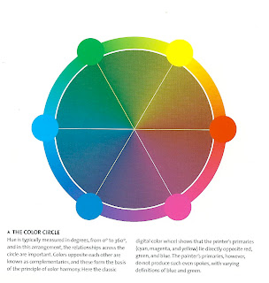 (Re-produced from The Photographers eye, Micheal Freeman, 2007)