12 May 2013
VARIETY WITH A LOW SUN
This next one is to show some of the advantages of shooting when the sun is low Frontal lighting, side light, back lighting and edge light. Wondering to use natural or artificial objects for this. Am
13 April 2013
JUDGING COLOUR TEMPERATURE 1
This exercise is to make us understand the effect of colour temperature on photography. I think understanding how colour temperature affects an image is important in the overall quality of the image when taken in consideration with other elements of design. Because the colour spectrum changes as the day progresses, we see different effects at different times of the day. Our camera's are designed to factor this when taking pictures. On my nikon D7000, i can choose from 2500k to10,000k which all have different effects on the image.
I have been taking pictures regularly of late trying to understand my camera very well and how it functions. I guess that is what separates a serious enthusiast or
Back to the exercise, we are to take 3 images in full sunlight during the middle of the day, one in shade during the middle of the day and one when the sun is close to the horizon. To do this, I tok a picture of my son in two of the scenarios described. The camera's white balance was set to daylight as required.
 |
| Image 1: ISO 1000, 50MM,0EV,F/4,1/1600,WB:DIRECT SUNLIGHT |
 |
| Image 2:ISO 1000,50MM,0EV,F/4,1/1,600, WB: SUNLIGHT, TAKEN IN SHADED AREA |
 |
| Image 3:ISO 1000,50MM,0RV,F/4,1/5000, WITH THE SUN ALMOST AT THE HORIZON |
I did some further reading on color tempeture on the internet it is described in wikipedia as "a characteristic of visible light that has important applications in lighting, photography,videography, publishing, manufacturing, astrophysics, horticulture, and other fields. The color temperature of a light source is the temperature of an ideal black body radiator that radiates light of comparable hue to that of the light source. In practice, color temperature is only meaningful for light sources that do in fact correspond somewhat closely to the radiation of some black body, i.e. those on a line from reddish/orange via yellow and more or less white to blueish white; it does not make sense to speak of the color temperature of e.g. a green or a purple light. Color temperature is conventionally stated in the unit of absolute temperature, the kelvin, having the unit symbol K.
Color temperatures over 5,000K are called cool colors (blueish white), while lower color temperatures (2,700–3,000 K) are called warm colors (yellowish white through red)".[1]
14 March 2013
HIGHER AND LOWER SENSITIVITY
HIGHER AND LOWER SENSITIVITY
A camera's sensitivity to light is measured by its ISO( International Standards Orgaanisation).It goes that the higher the sensitivity to light, the faster the shutter speed required. If you switch on the camera and set it to ISO 3000 example , you need a shutter speed and focal length that will balance out the light meter. A slow shutter speed like 4 seconds will allow too much light on to the sensor while a fast shutter speed will allow little light to pass through the sensor. A higher ISO reading is generally used in darker situations to get faster shutter speeds while a lower ISO reading gives us shots with less grain or noise since we are able to open up the aperture wide with less shutter speeds. |
| Image 1: ISO 320 ,50MM,F/5,1/640 |
 |
| Image 2:ISO 800,50MM,F/5,1/1600 |
 |
| IMAGE 3: ISO 2000,50MM,F/5,1/4000 |
 |
| Image 4: ISO 4000,50MM, F/5,1/8000 |
 |
| Image 5:ISO 6400,50MM,F/6.3,1/8000 |
 |
| Image 6: ISO 25600,50MM,F/13,1/5000 |
In the Images above, the lowest ISO used is 320 while the highest is ISO 25600. As seen, image no 6 is quite grainy. These shots were taken on a bright overcast day. I realised that setting the camera at higher ISO made it easier to snap a picture because the sensor is more sensitive to light and shutter speed has increased.
Bryan Peterson explains the concept further in page 20 of his book "Understanding exposures", Third Edition.He likens ISO to a worker bee. If a camera is set for ISO 100, in effect there are 100 worker bees and another one set for ISO 200 has 200 worker bees. The job of the worker bees is to gather the light that comes through the lens and make an image. If both lenses are set at the same aperture such that the same volume of light will be coming through the lenses, ISO 200 will record the image quickest since it has twice as many worker bees than ISO 100.
These days, a camera.s ISO ability is part of its selling price determinants, others being frames per second,build quality, and shutter actuations. Called low-light ability, some cameras are able to produce great details even when the ISO is set to high limits where you will expect to see grainy images in other lower camera's. Camera's like the Nikon D4 can produce usable pictures at ISO up 12500.

Image 7 Windstorm:ISO 25600, 70MM,F/25,1/50,notice the graininess at high ISO.
 |
| Image 8:ISO 1000,50MM,F/1.4,1/10 |
 |
| Image 9:ISO 500,70MM,0EV,F/7.1,1/25 |
 |
| Image 10:ISO 2500,70MM,0EV,F7.1,1/40 |
 |
| Image 11:ISO 6400,70MM,0EV,F7.1,1/5 |
MY THOUGHTS
Recently I have not been making as much progress as i would like on my OCA exercises lke i have oft mentioned due to work. But I set myself to it. As I was getting set last week to continue, my macbook pro hard disk crashed and i had to take it for repairs. Thankfully I was able to get it back in shape within two days and with my data backed up, there was,nt much problems after wards retrieving information.
I have also been spending a lot of time on the internet researching the works of wildlife photographers. I find myself drawn to this genre of photography admiring the works of bird photographer arthur morris and wildlife photographer moose petersen. In the UK , richard peters is also one heck of good wildlife photographer. I think two major reasons stand out for my interest in wildlife photography. Love of nature and not needing an animals permission before you photograph it. You only need to be very careful approaching wild animals. Another reason why i like nature photography is conservation. I believe photography has an important role to play in bringing to the fore conservation issues such as wildlife protection and preservation of flora and fauna.
Wildlife Photography by Uwe Skrzypczak is one book i have read lately and i truly enjoyed images of the big cats , some of which are quite humorous. I am presently making arrangements for a photo safari to Tanzania sometime in mid 2014. Images of the serengeti have stuck in my memory since childhood and i would like to see in reality. In wildlife photography, the best time to photograph animals is in the golden lights period from 6.30 to 9.00am and in the evenings from 4.30 to 6.00pm. By the time am going to tanzania , i should be in my second course module people and places.
11 February 2013
PROJECT FOUR: LIGHT, MEASURING EXPOSURE
Light has the greatest impact in photography. In this project, i will demonstrate effect of light on my photographs. I will take pictures at different times of the day and see the effects. As Photographers we know that the best images are the ones shot in the early mornings and late evenings when the sun is not too harsh. By midday when the sun is overhead, light becomes too harsh and does not give us very good pictures. So we see that shooting in the best light can disrupt normal schedules.
To be a successful photographer, you need to understand how the different elements of aperture, shutter speed and ISO combine to produce balanced exposures. But as an amateur photographer, i have made effort also to understand my camera and how it works . This is very important. A successful photographer needs the eyes to see what others can and as well use his tools to capture his art or images.
The concepts of aperture, shutter speed and ISO need good understanding. When i started out they seemed quite confusing but as i read the more i began to understand. What sets a good professional photographer part is his or her ability to adapt these settings when taking pictures to produce excellent images.
In " Understanding exposures, third edition by Bryan Peterson, p 16, a correct exposure is defined as a simple combination of the three important factors of aperture, shutter speed and ISO. These same factors have always been at the heart of every exposure whether that exposure was correct or not. So put another way exposure to LIGHT is determined by these three factors.
In my OCA reference manual on page 106, its mentioned that the amount of light determines how a photograph can be taken and even whether it can. Camera sensors are designed to work optimally in normal daylight, just as are most films. We are told that the quality of light can also make an essential difference to a picture being often the one element that can change significantly in a view.
I chose a pool side to demonstrate this at noon when the light was already hash and the sun was at highest inclination
 |
| Image 2: ISO 100,50MM, 0 EV, F/5, 1/640 |
 |
| Image 1: ISO 100,50MM, 0 EV, F/5, 1/320 |
 |
| Image 3: ISO 100,50MM, 0 EV, F/5, 1/1250 |
 | ||
The shutter mechanisms function is to admit light into the camera for a specific length of time.Shutter speeds are indicated on the viewfinder as whole numbers such as 60,125,250 and 500 but they are actually fractions of time e.g 1/60,1/125,1/250 etc. In the brightest image above i used a shutter speed of 1/320s while the darkest image has a shutter speed of 1/2000s meaning it allows much less time to hit the sensor, hence the dark image.
SILHOUETTE |
Silhouette images i find very appealing. I learnt to take silhouettes at the London school of Photography when i attended a five day program in April 2011. The course was to basically expose me to the rudiments of my new DSLR the nikon D7000. You set the light meter on the camera to zero against an illuminated background and then focus on the subject and shoot. I tried taking a picture of my son in front of a window.
The light meter takes the reading outside and when the camera is re-oriented, the sensors pick -up the in metered part of the image resulting in the image above. The the green foliage behind which contrasts sharply with the young mans dark outline. Am still practicing to take silhouettes in unconfined spaces.
 |
| Image 5:ISO 200 ,50MM, 0 EV, F/16,1/15 |
 |
| Image 6: ISO 200, 50MM,0 EV, F/16, 1/15 |
TUTOR FEEDBACK
My tutor feedback came on February 11, 2013 for assignment 3 which i submitted a week earlier. This is 10 good months after my last assignment. He was not quite impressed with the quality of my work and i quite understand that. The important thing here is to take in all the advice and suggestions he put forward.
1. Improve picture composition
2. Spend more time looking at examples by professional practitioners
3. Do plenty of research and independent learning to enhance my creative,theoretical understanding an practical approach to photography.
4. Make more detailed reflective notes and develop my thoughts about how to approach a subject.
He mentioned though that i have demonstrated an understanding of color relationships, but some of my interpretations are quite loose and no diagrams were submitted. This was partly because i was unable to navigate the blogger page to create diagrams.
With all these at the back of my mind, i proceed to the next project on Light.
With all these at the back of my mind, i proceed to the next project on Light.
03 February 2013
ASSIGNMENT 3
In assignment 3 i am expected to show command of color in photography . The following photographs will show the use of colours in deliberate relationships.
The image 1 above captures the complimentary colours red and green dominating the picture and giving it a unique look. As stated earlier colours that are opposite each other in the color circle appear ton balance each other and are called complimentary.
The next one above shows coliours spaced about a third of the way around the circle, very different from each other but not quite complimentary. The relationship is not quite harmonious but is eye- catching.
In this photo above, i try to show colours near each other on the color cycle as in cool or warm range of colours. Though its the same tower, it is quite interesting to see that parts of it are trending yellow while some parts are still green following the maturity cycle of the plant.
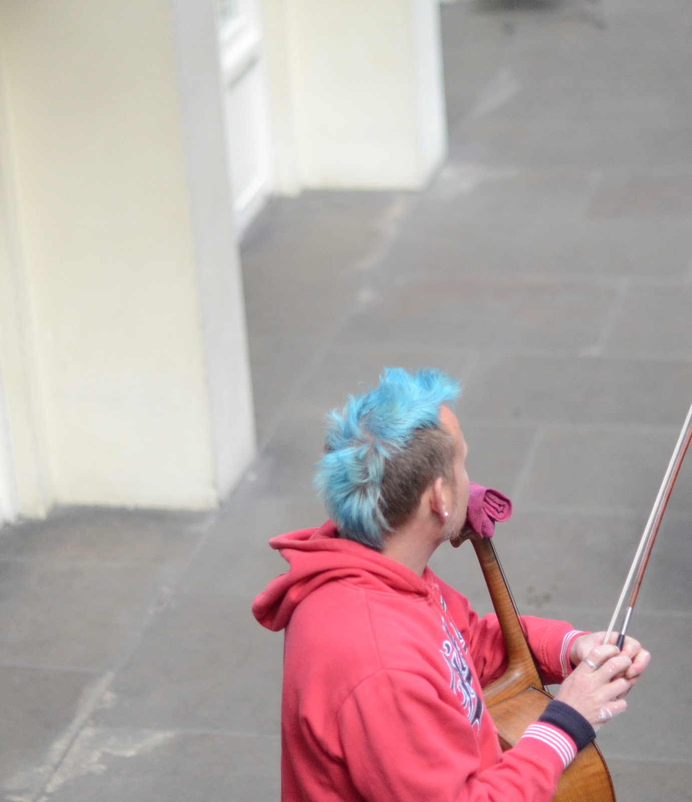
In image 4 , i try to depict where one small area of color represented by the mans blue hair sits against a much larger background of another color (his red top) as a spot or accent. I took this picture at covent garden in london .
Image 5 depicts color harmony through similar colours on the color cycle. This was a brocade material i tools from my wife to illiustrate the point. As can be seen the green and yellow colours are side by side in the color cycle.
For contrasting colours I did not want to use only still life but something realistic. This photo of a muslim praying ground depicts my idea of contrasting colours coming together. I would have loved the picture to be a bit more close-up but that may also not depict the contrasts. gaily dressed men and women coming out pray.
In Image no 8, which i took from my hotel room window, a typical market scene in lagos is shown with people and hardwares in different colours all contrasting sharply with one another. This photo trends more towards the street photography genre but i hope it shows examples of contrasting colours.
 |
| Image 1 Complimentary colours: ISO 2500, 50MM, F2.8, 1/30 |
 |
| Image 2 Colours spaced about a third of the way: ISO 1250,300MM,F/25,1/160 |
 |
| Image 3 Colours near each other on the color cycle: ISO 1250,86MM,F/22,1/320 |
In this photo above, i try to show colours near each other on the color cycle as in cool or warm range of colours. Though its the same tower, it is quite interesting to see that parts of it are trending yellow while some parts are still green following the maturity cycle of the plant.
 |
| Image 4 One color sitting on top another :ISO 1250,50MM,F1.4,1/3200 |
 |
| Image 5 Colour harmony through similar colours:ISO 64,4.3MM,F2.4,1/1577 using iPhone camera |
Image 5 depicts color harmony through similar colours on the color cycle. This was a brocade material i tools from my wife to illiustrate the point. As can be seen the green and yellow colours are side by side in the color cycle.
 |
| Image 6: Colour contrasts through contrasting colours:ISO 64,4.3MM,F2.4,1/345, IPHONE. |
 |
| Image 7: Contrasting Colours |
 |
| Image 8: Contrasting colours |
For contrasting colours I did not want to use only still life but something realistic. This photo of a muslim praying ground depicts my idea of contrasting colours coming together. I would have loved the picture to be a bit more close-up but that may also not depict the contrasts. gaily dressed men and women coming out pray.
In Image no 8, which i took from my hotel room window, a typical market scene in lagos is shown with people and hardwares in different colours all contrasting sharply with one another. This photo trends more towards the street photography genre but i hope it shows examples of contrasting colours.
 |
| Image 9: Contrasting colours red and yellow |
 |
| Image 10: Colour accent: the white color of the mans dress is out of proportion to the space it occupies. The color accent demands attention. |
I hereby submit the assignment at this stage hoping to get your usual sincere critique.
COLOURS INTO TONES IN BLACK AND WHITE
I am sorry for the long period of dormancy due to work commitments. Any time i find myself lagging behind, something comes up to inspire me the more like the recent story i read in the dailymail online about the Legendary Photojournalist Art shay who at 90 years of age is still practicing Photography. It was an interesting read.
My Photography interest has also drawn me to writing and blogging which i probably would not have ventured into without taking this course.
In this next exercise, we are demonstrate colours into tones in black and white
 |
| Image 1: ISO 2500,50MM, F7.1, APERTURE:1/8 |
 |
| Image 2: Neutral version |
Subscribe to:
Posts (Atom)