10 June 2012

COLOUR RELATIONSHIPS


This next exercise on color relationships is to produce one photograph for each combination pf primary and secondary colours

Image 1: 50mm,ISO 800 ,F/2, 1/200

This was taken in covent garden, London and what attracted me to the man was his costume. Although blue as a primary color dominates the subject, the presence of other secondary colours adds to the attraction.While the background of the picture has a shallow depth of field because my lens was wide open at f/2, it shows additional primary/secondary combination of red and green  on the plastic dummy.

Image 2:ISO 1250,300mm,f/25,1/160
The combination of green and pink in image 2 above serves to highlight primary and secondary color combinations. Pink is not exactly one of the primary or secondary colours.It is considered to be a tint of red and according to wikipedia, most variations of pink lie within red, white and magenta colors.But its presence in this picture tends to pin the viewers attention to the picture.. I cropped this  to get rid of an electric pole standing in between . I have become very conscious of my compositions ever since the tutor drew my attention to it. Composition is important and am trying very hard to make it second nature any time i put my eyes on the viewfinder.

Image 3: ISO 800,50mm,f/7.1,1/160

The blue and red colors of school children's jackets caught my attention. There are two elements of composition at play here,namely color and line. Though the composition is not too perfect, the the colours on their jackets appear to compliment each other strongly.

In Michael Freemans The Photographers Eye,p.120, color relationships are discussed with the author emphasizing on treating harmony in the sense of pleasing acceptable relationships. One being complementary harmony (hue across the color circle), and the other being harmony of similarity (hues from the same sector of the color circle). The author mentions that in successive contrast, if you stare at colored patch for at least  thirty minutes and then shift gaze to a blank area of white, you are likely to see an after image in the complimentary color- the opposite across the color circle. A similar though less dramatic effect is seen when colors are side by side in which the eye tends to compensate, while in the color circle, mixing two opposites produce a neutral.


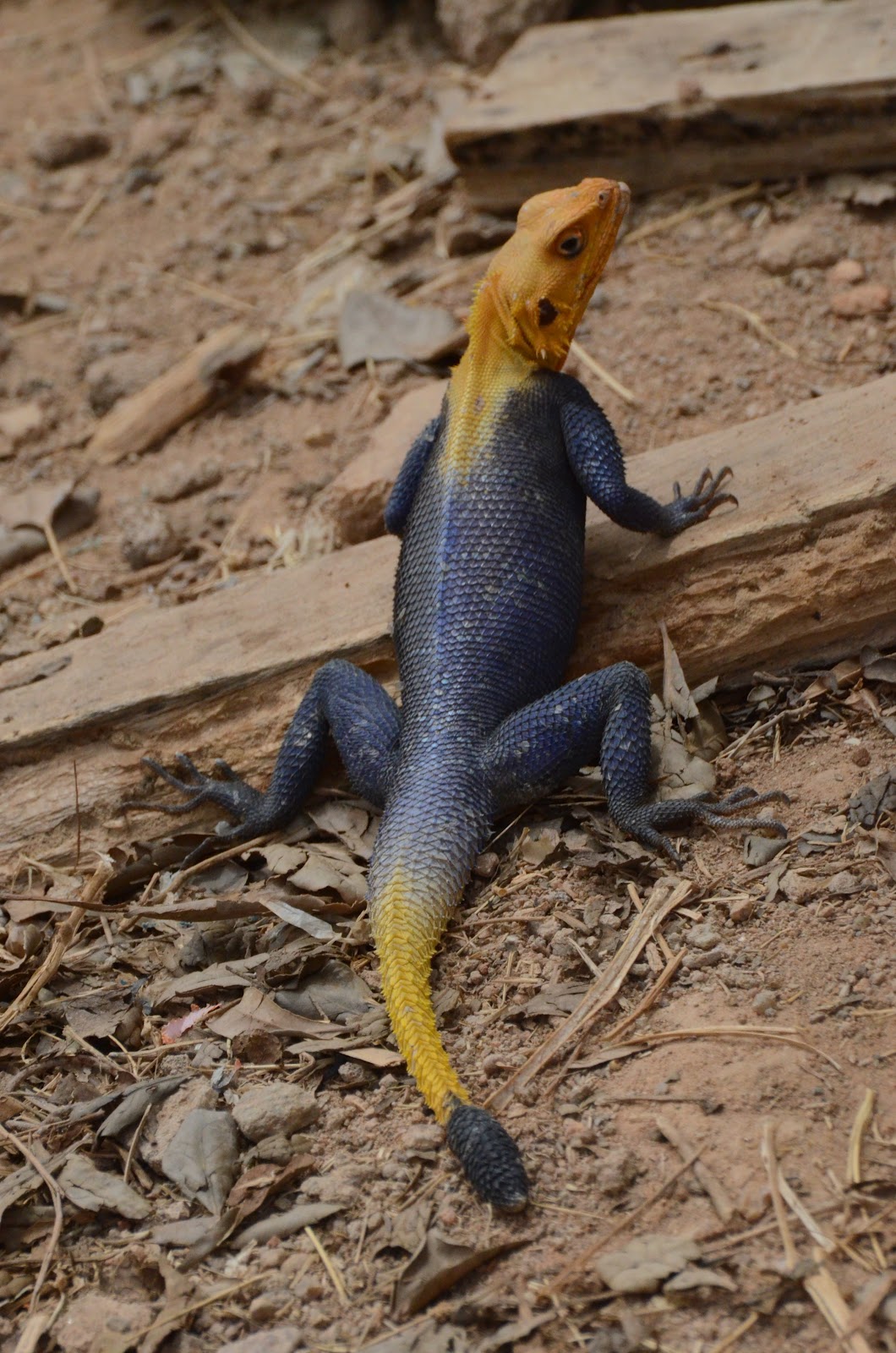
Image 4: ISO 2500,300mm,f/11,1/2000


Image 4 is for the second part of the exercise in which am to produce images featuring appealing color images. Well the agama lizard pictured above caught my attention. With its distinct blue color in between yellows. Agama is a long-tailed, insect-eating lizard of the genus Agama. They can be found in many sizes and are widespread in sub-saharan africa. 


PRIMARY & SECONDARY COLOURS

Phew! Back after a long break.I Initially did not understand this assignment maybe because i was not paying as much attention. But i later recognized that i have to find scenes or parts of scenes that are dominated by a single one of the primary or secondary colors. The instructor advises that rather than take pictures of walls and doors, we should find colors that are less arbitrary.
Well i was in London recently and as part of this work, i headed to covent garden where i felt i could get some interesting features. i came across this:

Image 1:135mm, ISO 1000, f/5,1/320 
I have not varied the exposure here. But i wanted to capture the different colors in the dish which made good photographic subject.  I also took pictures of the green lawn in Soho park and varied exposure as shown :

Covent garden has always been a favorite destination for my photography because of the different people you see and colors as as well.


Image 2:ISO 200,70mm,f/4.5,1/125

Image 3:ISO 200,70mm,f/6.3,1/125

Image 4:ISO 200,70mm,f/9, 1/125

In this example above, i varied only the aperture and maintained a constant focal length, ISO and shutter speed to see the effect. Its clear that as aperture decreases and less light hits the sensor, the image gets darker.


I believe the three qualities of color need to be understood very well to progress. These are hue, saturation and brightness.In the Photographers eye by Micheal freeman 2007, Hue is defined as the quality that gives each color its name and is what most people mean when they use the word color. yellow, red, green etc are all hues. Saturation is the intensity or purity of hue, with the minimum being a completely neutral gray, and brightness determines whether the hue is dark or light. Until i read this , i never knew the hue is actually the color of an item or object.

The color circle is shown below which explains how hue is measured.
(Re-produced from The Photographers eye, Micheal Freeman, 2007)

In my Tutors last feedback, he referred me to the works of some renowned Photographers like Jay Maisel, the New york based  Photographer whom i find to be quite an exceptional guy. Its remarkable that even at 84 , he still shoots and offers workshops. It goes to show the excitement and thrill of this art. I find that he is able to blend composition and a motley of colors into a picture that fixates the viewer.

I have also looked at the works of other photographers with color and am quite impressed with Abiola Lapites photos of a carnival i believe is in the UK. He uses a variety of Lenses but  does an excellent job with the Nikon 300mm F2.8 as can be seen here http://www.flickr.com/photos/abiola/sets/72157624126941763/?page=4


For red color, i took a picture of  a bed sheet in my house which i must concede is a rather boring subject, but since i was unable at the point in time to find something more animating, i went ahead taking 3 shots with constant focal length and shutter speed, but varying apertures by half a stop. take a look.

Image 4:ISO 1250, 70mm,f/20,1/10

Image 5:ISO 1250,70mm,f/22,1/10


Image 6: ISO 1250,70mm, f/25,1/10

The  images were back-lit by the morning sun coming from the window. The image 4 tends to match better with the red in the color circle.


As i try to complete this exercise, i am finding it a bit difficult getting the primary colours to photograph in a way that would be appealling to me. I suddenly discover that finding scenes or parts of scenes that are each dominated by a single one of the primary and secondary colours without photographing a paint manufacturers catalogue is not so smooth after all. Which in my reckoning explains why scenes  like that become a photographic attraction.

The limited flowers in my immediate environment do not give the spectral variety i need to make a good impression on my tutor. I have however managed to take some pictures like the one below which portrays a yellowish green hue:


Image 7:ISO 1250,86mm,f/22,1/320

Image 8:ISO,86mm,f/25,1/320

Image 9:ISO 1250,86mm,f/29,1/320


In page 115 of the photographers eye, the color green is described as the first and foremost color of nature and its associations and symbolism, usually positive, come principally from this. Plants are green and so it is the color of growth, by extension it carries suggestions of hope and progress. It goes further  that for the same reasons, yellowish-green(as in the images above)has spring-like associations of youth.

My intent was to finish The art of Photography in one year, If am able to sustain a little more tempo, i may conclude by September or October, but its looking like a bit later to me. Photography is best combined with writing and putting your thoughts together. My realization is that wildlife photography appeals to me a lot and i have spent quite sometime viewing the websites of accomplished wildlife photographers like Andy Rouse, Moose peterson, Andy Biggs, Boyd Norton, and a host of others. In this genre of photography, i also fine that color plays a prominent role.  It is therefore important that i understand the application of color in photography in order to produce visually appealing pictures.