Well i was in London recently and as part of this work, i headed to covent garden where i felt i could get some interesting features. i came across this:
 |
| Image 1:135mm, ISO 1000, f/5,1/320 |
Covent garden has always been a favorite destination for my photography because of the different people you see and colors as as well.
 |
| Image 2:ISO 200,70mm,f/4.5,1/125 |
 |
| Image 3:ISO 200,70mm,f/6.3,1/125 |
 |
| Image 4:ISO 200,70mm,f/9, 1/125 |
In this example above, i varied only the aperture and maintained a constant focal length, ISO and shutter speed to see the effect. Its clear that as aperture decreases and less light hits the sensor, the image gets darker.
I believe the three qualities of color need to be understood very well to progress. These are hue, saturation and brightness.In the Photographers eye by Micheal freeman 2007, Hue is defined as the quality that gives each color its name and is what most people mean when they use the word color. yellow, red, green etc are all hues. Saturation is the intensity or purity of hue, with the minimum being a completely neutral gray, and brightness determines whether the hue is dark or light. Until i read this , i never knew the hue is actually the color of an item or object.
The color circle is shown below which explains how hue is measured.
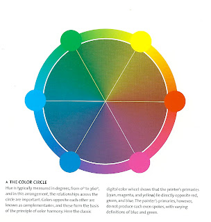 (Re-produced from The Photographers eye, Micheal Freeman, 2007)
In my Tutors last feedback, he referred me to the works of some renowned Photographers like Jay Maisel, the New york based Photographer whom i find to be quite an exceptional guy. Its remarkable that even at 84 , he still shoots and offers workshops. It goes to show the excitement and thrill of this art. I find that he is able to blend composition and a motley of colors into a picture that fixates the viewer.
I have also looked at the works of other photographers with color and am quite impressed with Abiola Lapites photos of a carnival i believe is in the UK. He uses a variety of Lenses but does an excellent job with the Nikon 300mm F2.8 as can be seen here http://www.flickr.com/photos/abiola/sets/72157624126941763/?page=4
For red color, i took a picture of a bed sheet in my house which i must concede is a rather boring subject, but since i was unable at the point in time to find something more animating, i went ahead taking 3 shots with constant focal length and shutter speed, but varying apertures by half a stop. take a look.
The images were back-lit by the morning sun coming from the window. The image 4 tends to match better with the red in the color circle.
As i try to complete this exercise, i am finding it a bit difficult getting the primary colours to photograph in a way that would be appealling to me. I suddenly discover that finding scenes or parts of scenes that are each dominated by a single one of the primary and secondary colours without photographing a paint manufacturers catalogue is not so smooth after all. Which in my reckoning explains why scenes like that become a photographic attraction.
The limited flowers in my immediate environment do not give the spectral variety i need to make a good impression on my tutor. I have however managed to take some pictures like the one below which portrays a yellowish green hue:
In page 115 of the photographers eye, the color green is described as the first and foremost color of nature and its associations and symbolism, usually positive, come principally from this. Plants are green and so it is the color of growth, by extension it carries suggestions of hope and progress. It goes further that for the same reasons, yellowish-green(as in the images above)has spring-like associations of youth.
My intent was to finish The art of Photography in one year, If am able to sustain a little more tempo, i may conclude by September or October, but its looking like a bit later to me. Photography is best combined with writing and putting your thoughts together. My realization is that wildlife photography appeals to me a lot and i have spent quite sometime viewing the websites of accomplished wildlife photographers like Andy Rouse, Moose peterson, Andy Biggs, Boyd Norton, and a host of others. In this genre of photography, i also fine that color plays a prominent role. It is therefore important that i understand the application of color in photography in order to produce visually appealing pictures.
I believe the three qualities of color need to be understood very well to progress. These are hue, saturation and brightness.In the Photographers eye by Micheal freeman 2007, Hue is defined as the quality that gives each color its name and is what most people mean when they use the word color. yellow, red, green etc are all hues. Saturation is the intensity or purity of hue, with the minimum being a completely neutral gray, and brightness determines whether the hue is dark or light. Until i read this , i never knew the hue is actually the color of an item or object.
The color circle is shown below which explains how hue is measured.

In my Tutors last feedback, he referred me to the works of some renowned Photographers like Jay Maisel, the New york based Photographer whom i find to be quite an exceptional guy. Its remarkable that even at 84 , he still shoots and offers workshops. It goes to show the excitement and thrill of this art. I find that he is able to blend composition and a motley of colors into a picture that fixates the viewer.
I have also looked at the works of other photographers with color and am quite impressed with Abiola Lapites photos of a carnival i believe is in the UK. He uses a variety of Lenses but does an excellent job with the Nikon 300mm F2.8 as can be seen here http://www.flickr.com/photos/abiola/sets/72157624126941763/?page=4
For red color, i took a picture of a bed sheet in my house which i must concede is a rather boring subject, but since i was unable at the point in time to find something more animating, i went ahead taking 3 shots with constant focal length and shutter speed, but varying apertures by half a stop. take a look.
 |
| Image 4:ISO 1250, 70mm,f/20,1/10 |
 |
| Image 5:ISO 1250,70mm,f/22,1/10 |
 |
| Image 6: ISO 1250,70mm, f/25,1/10 |
The images were back-lit by the morning sun coming from the window. The image 4 tends to match better with the red in the color circle.
As i try to complete this exercise, i am finding it a bit difficult getting the primary colours to photograph in a way that would be appealling to me. I suddenly discover that finding scenes or parts of scenes that are each dominated by a single one of the primary and secondary colours without photographing a paint manufacturers catalogue is not so smooth after all. Which in my reckoning explains why scenes like that become a photographic attraction.
The limited flowers in my immediate environment do not give the spectral variety i need to make a good impression on my tutor. I have however managed to take some pictures like the one below which portrays a yellowish green hue:
 |
| Image 7:ISO 1250,86mm,f/22,1/320 |
 |
| Image 8:ISO,86mm,f/25,1/320 |
 |
| Image 9:ISO 1250,86mm,f/29,1/320 |
In page 115 of the photographers eye, the color green is described as the first and foremost color of nature and its associations and symbolism, usually positive, come principally from this. Plants are green and so it is the color of growth, by extension it carries suggestions of hope and progress. It goes further that for the same reasons, yellowish-green(as in the images above)has spring-like associations of youth.
My intent was to finish The art of Photography in one year, If am able to sustain a little more tempo, i may conclude by September or October, but its looking like a bit later to me. Photography is best combined with writing and putting your thoughts together. My realization is that wildlife photography appeals to me a lot and i have spent quite sometime viewing the websites of accomplished wildlife photographers like Andy Rouse, Moose peterson, Andy Biggs, Boyd Norton, and a host of others. In this genre of photography, i also fine that color plays a prominent role. It is therefore important that i understand the application of color in photography in order to produce visually appealing pictures.
No comments:
Post a Comment