In assignment 3 i am expected to show command of color in photography . The following photographs will show the use of colours in deliberate relationships.
 |
| Image 1 Complimentary colours: ISO 2500, 50MM, F2.8, 1/30 |
The image 1 above captures the complimentary colours red and green dominating the picture and giving it a unique look. As stated earlier colours that are opposite each other in the color circle appear ton balance each other and are called complimentary.
 |
| Image 2 Colours spaced about a third of the way: ISO 1250,300MM,F/25,1/160 |
The next one above shows coliours spaced about a third of the way around the circle, very different from each other but not quite complimentary. The relationship is not quite harmonious but is eye- catching.
 |
| Image 3 Colours near each other on the color cycle: ISO 1250,86MM,F/22,1/320 |
In this photo above, i try to show colours near each other on the color cycle as in cool or warm range of colours. Though its the same tower, it is quite interesting to see that parts of it are trending yellow while some parts are still green following the maturity cycle of the plant.
 |
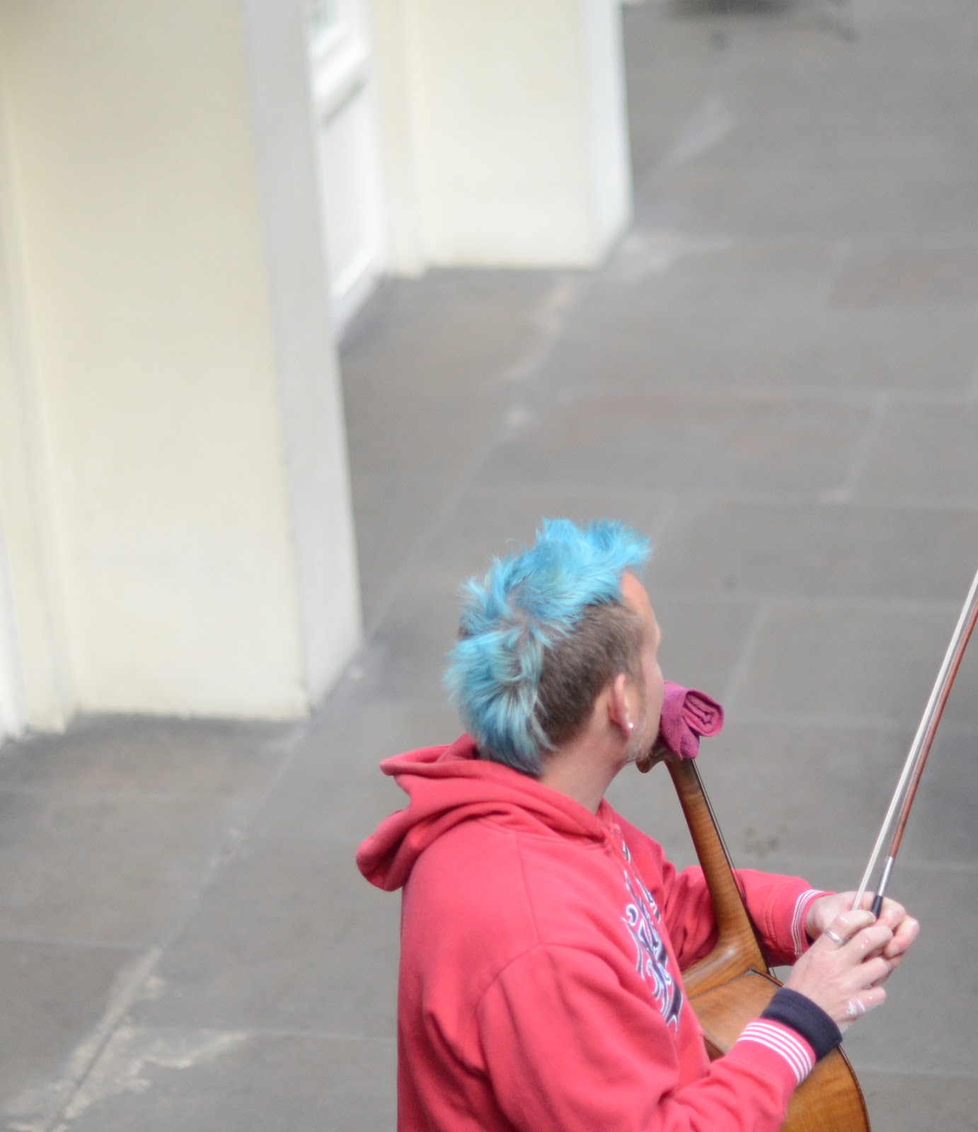
| Image 4 One color sitting on top another :ISO 1250,50MM,F1.4,1/3200 |
In image 4 , i try to depict where one small area of color represented by the mans blue hair sits against a much larger background of another color (his red top) as a spot or accent. I took this picture at covent garden in london .
 |
| Image 5 Colour harmony through similar colours:ISO 64,4.3MM,F2.4,1/1577 using iPhone camera |
Image 5 depicts color harmony through similar colours on the color cycle. This was a brocade material i tools from my wife to illiustrate the point. As can be seen the green and yellow colours are side by side in the color cycle.
 |
| Image 6: Colour contrasts through contrasting colours:ISO 64,4.3MM,F2.4,1/345, IPHONE. |
 |
| Image 7: Contrasting Colours |
 |
| Image 8: Contrasting colours |
For contrasting colours I did not want to use only still life but something realistic. This photo of a muslim praying ground depicts my idea of contrasting colours coming together. I would have loved the picture to be a bit more close-up but that may also not depict the contrasts. gaily dressed men and women coming out pray.
In Image no 8, which i took from my hotel room window, a typical market scene in lagos is shown with people and hardwares in different colours all contrasting sharply with one another. This photo trends more towards the street photography genre but i hope it shows examples of contrasting colours.
 |
| Image 9: Contrasting colours red and yellow |
 |
Image 10: Colour accent: the white color of the mans dress is out of proportion to the space it occupies. The color accent demands attention.
|
I hereby submit the assignment at this stage hoping to get your usual sincere critique.